Project - 2024
ICMC Landing page redesign
A LITTLE ABOUT ICMC…
The International Children’s Media Center (ICMC) is a nonprofit with a big idea for 21st-century learning: humanizing how children use and engage digital devices.
Instead of focusing on “what, when, and how much” media children watch, the ICMC focuses on how youth engage and use screens. This evidence-based approach activates “human technology” to boost literacy, emotional intelligence, and academic success. ICMC programs train children and adults to be self-aware and intentional so they develop healthy tech habits that stop screen addiction before it starts.
PROBLEM STATEMENT
Nicole Dreiske, the founder of ICMC wants to increase awareness of the unique mission and extend developmental programs focussed on healthy e-learning screen habits for children. However, she feels that this motive is not reaching a wide audience range and the revenues and funding are not as significant to support the organization.
“How might we raise awareness of this mission to a wider audience, increase website traffic, and let them know of various programs and workshops that ICMC offers?”
ROLE
Researcher, UX Designer in collab. with 2 other designers
SCOPE
8 weeks
PROCESS
Research, interviews, survey, ideation, prototyping, user testing, evaluation
TOOLS
Figma, Miro, Figjam
Here is a screen recording of the redesigned ICMC landing page in both desktop and mobile version layouts. I scroll through the entire page showing different components that are redesigned for a landing page refresh
USER SURVEYS & INTERVIEWS
Understanding the Current Experience
Firstly, I started off by conducting a website audit to understand the experience of navigating the current website.
After conducting a website audit, I moved into validating findings through surveys, interviews, affinity mapping, and card sorting. I utilized UserTesting.com for surveys, Google Meet for interviews, and FigJam for affinity mapping.
To understand what were users’ first impressions of the current website, we surveyed 14 users from our local network about their experience with the website. We followed up with 6 user interviews to analyze their viewpoint of the current website and receive quality feedback.
Website Audit comments
USER SURVEY FINDINGS
More than half the participants felt that the structure and design of the website were very messy even though it had good information content. They expect more consistency in structure and layout.
Most of the users strongly felt that the color choice of the website could be improved. They felt that the bold green color made them think that it was an environment/sustainability-related website.
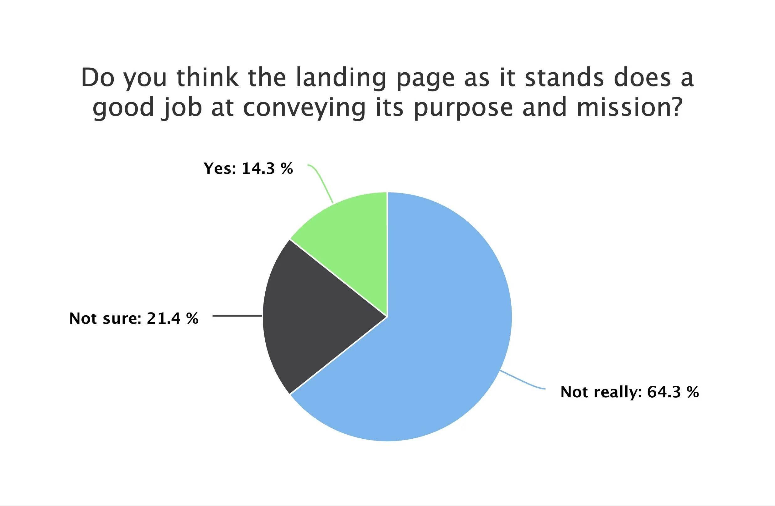
64.3% of the participants felt that the landing page did not fully convey its purpose and mission, while only 14.3% felt that it would.
More than 75% of the users didn’t comprehend what services ICMC provides - they were confused if they were classes or workshops. One of the users mentioned that she didn’t read it since the text style and content looked so busy.

Impressions of Landing Page?

Purpose & Mission of Landing Page?

Impressions of ICMC services?
CARD SORTS & AFFINITY MAPPING
With these outcomes, I proceeded to do card sorts and affinity mapping. I always enjoy this phase, as it really helps me step into my user’s shoes, highlights their unique quotes, and sparks my creativity.

AFFINITY MAPPING
Here I made some rough sketches of the redesigned landing page
Current Landing page
Newer landing page - SEO Friendly
Current ‘How we can help’ & Testimonial sections
Newer ‘How we can help’ & Testimonial versions
Old Design - Hero section
New Design - Hero section
LOW-FIDELITY WIREFRAMES
My team and I designed low-fidelity wireframes using Figma. We templated this sketch layout based on what were the most important requirements for the landing page according to our main stakeholder, Nicole Dreiske. We refined the layout of the new website to make it look more succinct and consistent with the remaining elements on the page. Accessibility and consistency were the key aspects we kept in mind while designing these lo-fi wireframes.
USABILITY TESTING
I created an A/B Testing framework as an interview guide, allowing us to follow a structured interviewing process, ensuring that each team member records their interview consistently.
We conducted 6 user interviews and then scribed our findings on Figjam board. Each interview took around 30 mins and was conducted both in person and on Google Meet.
As per this framework, we compared 2 versions of our website - the current ICMC website with the final version of the website. We took detailed notes of what participants would say so that we can build a robust affinity map incorporate into our redesign.
Old Design - Our Services
New Design - Our Services
USABILITY TESTING RESULTS & AFFINITY MAPPING
After our interview, we grouped and categorized the data into a user insight documentation which enabled us to have a clearer understanding of the user experience. I created affinity maps to organize the notes I had taken and feedback I received and logged these into a user insight documentation on Figjam in order to prioritize needed iterations.
We took detailed notes on what participants say and behave and answered the questions accordingly. One sticky note was allocated to each piece of feedback and placed in the user insight documentation of affinity map. The user insights of the current website were compared to those of the redesigned website.
AFFINITY MAPPING
Based on the above Usability testing, I mapped all the user testing insights for different sections of the website into an Affinity Map. I created affinity Maps for current and version 3 websites.
For example, under the Menu/Hero section, most users felt they would like to have the menu/navigation bar sticky to the top as it provides more user control. On the other hand, they were also confused about what services ICMC provides due to poorly designed UI and many color contrasts.
Similarly, I have mapped all the user feedback into different other sections of the website. The main agenda behind this process was to be able to derive insightful conclusions from this exercise and implement revised changes to the new iteration of the website.
USABILITY TESTING INSIGHTS TAKEAWAYS
Finally, I analyzed takeaways from user insight feedback and derived conclusions from the user testing insights through presentation slides.
Major Takeaways:
All 6 participants preferred the redesign, citing improved informational clarity, simpler navigation, and clearer hierarchy.
4 out of 6 participants didn’t appreciate the color choice of the current website, expressing that the vibrancy of the current colors is straining the eyes. On the other hand, they all preferred the color choices of the redesign.
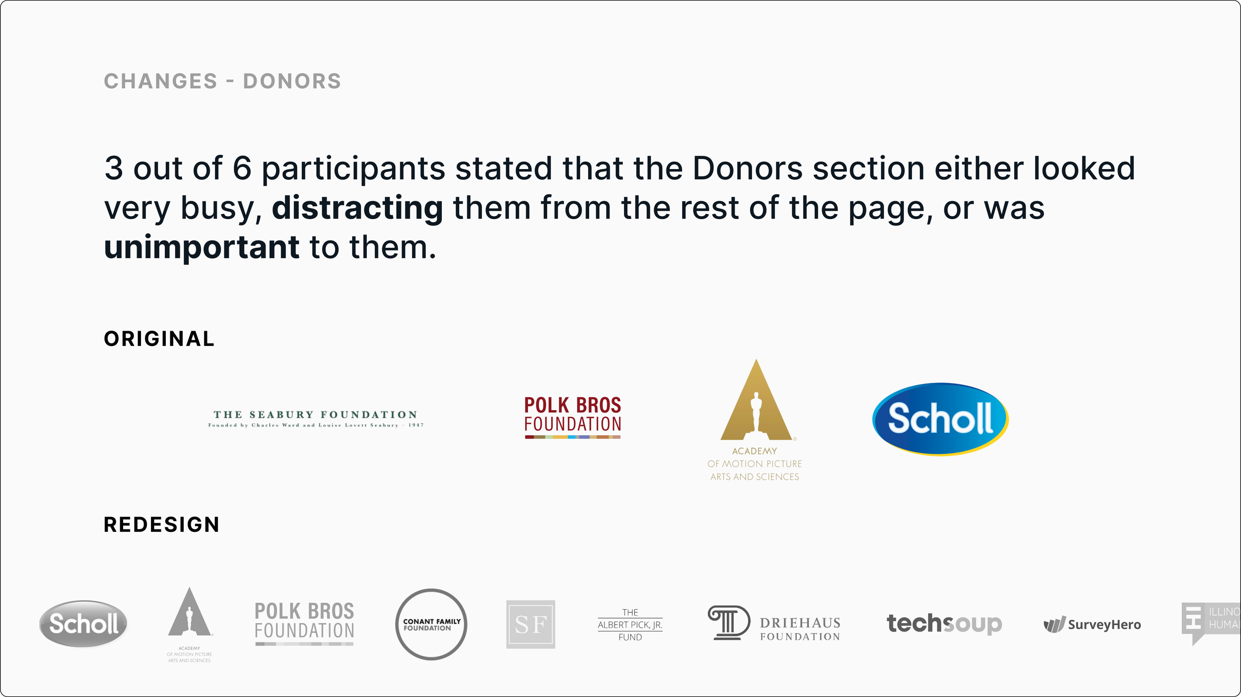
3 out of 6 participants struggled with reading the content due to the lack of hierarchy and structure.
6 out of 6 users agreed that the redesigned page would encourage them to explore further and engage with the ICMC website, compared to the original.


Old Design
New Design
DESIGN SYSTEM & STYLE GUIDE
We came up with a design system to add consistency, structure and communication across all team members. We chose simple readable ‘Oswald’ font type that would improve reading legibility at both small and large sizes. The colour palette is mature yet modern and has good contrast. We also prescribed device dimensions and column settings illustrating column, gutter and margin widths.
DEVICE DIMENSIONS
COLOR PALETTE
TYPOGRAPHY
LOGO, BUTTONS & NAVBAR
REDESIGNING FOR ICMC TAUGHT ME
Solving even smallest design problems can help improve the aesthetic look of the website. It was great to hear from my participants that the redesigned application was much cleaner and succinct to the eyes compared to the original one.
I love how the ICMC website evolved and expanded to include all visually appealing design items as this makes a huge difference in the eyes of the viewer which will lead to the users staying on the page for longer and continue scrolling to know more about the website, without confusing or compelling them to click off of the page.
Designing with the user in mind is crucial. I've always held this belief and implemented it in my work. This approach is especially vital in UX design. I invest significant effort into understanding users before starting the wireframing process. I go the extra mile to connect with the target audience and truly comprehend their challenges and pleasures. My natural drive to grasp what genuinely motivates people, coupled with my ability to empathize, makes creating for them a genuine pleasure.


